Get Down
Brand Identity, Packaging & Art Direction.
OVERVIEW
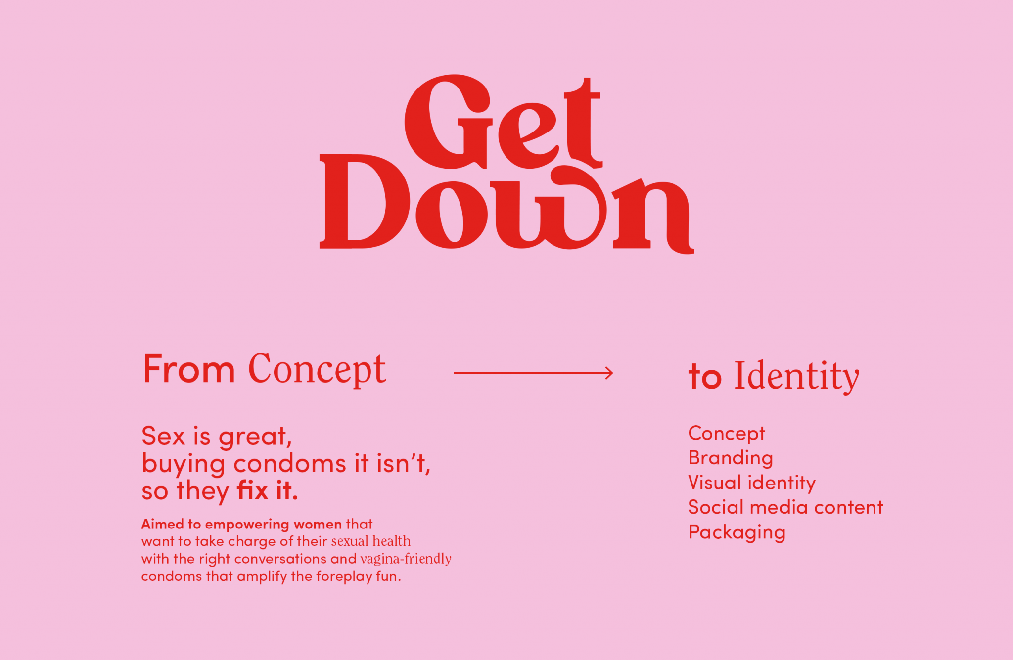
Most condom brands talk to men, and the ones aimed at women tend to be clinical or quietly embarrassing. Get Down is a condom brand created from scratch for young women navigating their first sexual experiences, designed to make them feel informed, confident and in control.
THE CHALLENGE
Designing a sexual health product for teenage girls means walking a fine line. Too serious and it feels like a school pamphlet. Too playful and it trivialises something that matters. The brand had to be something a young woman would actually want to pick up off the shelf.
THE SOLUTION
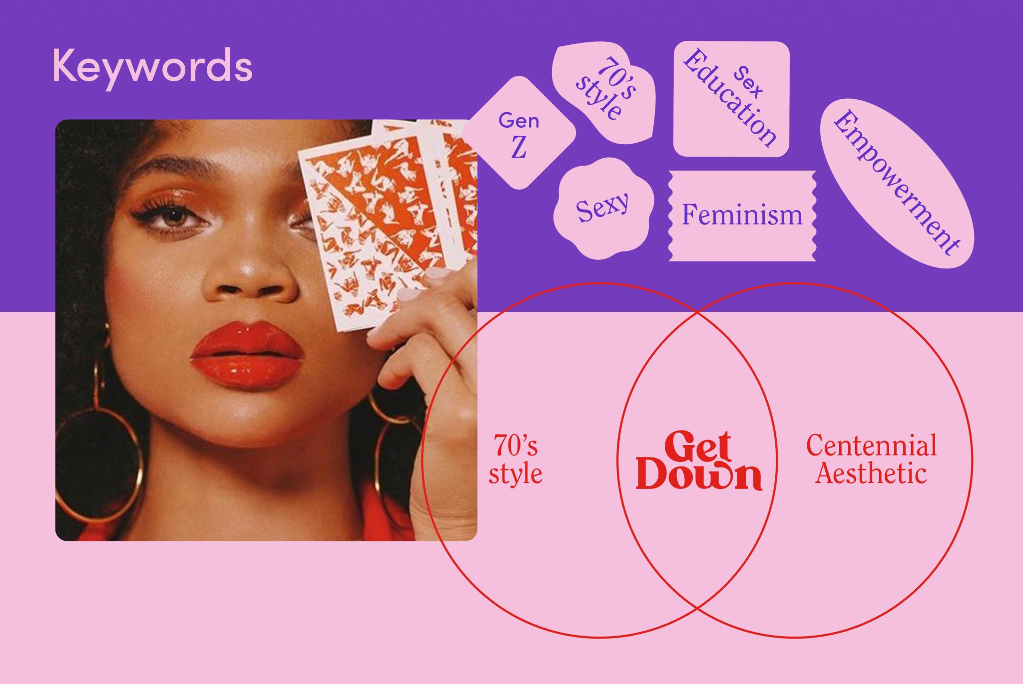
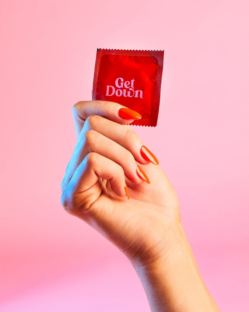
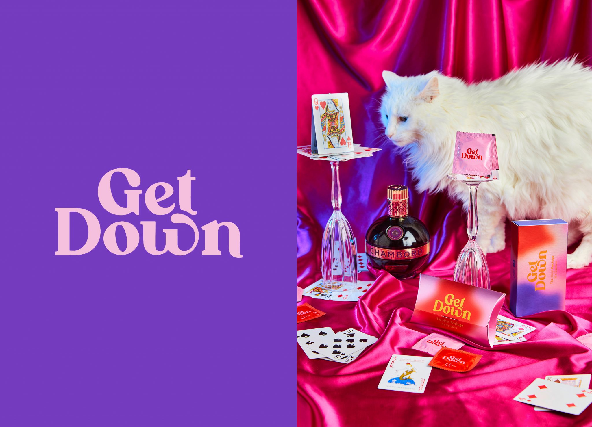
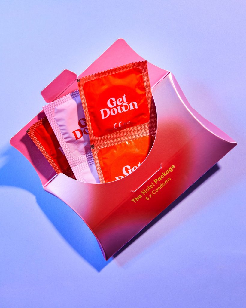
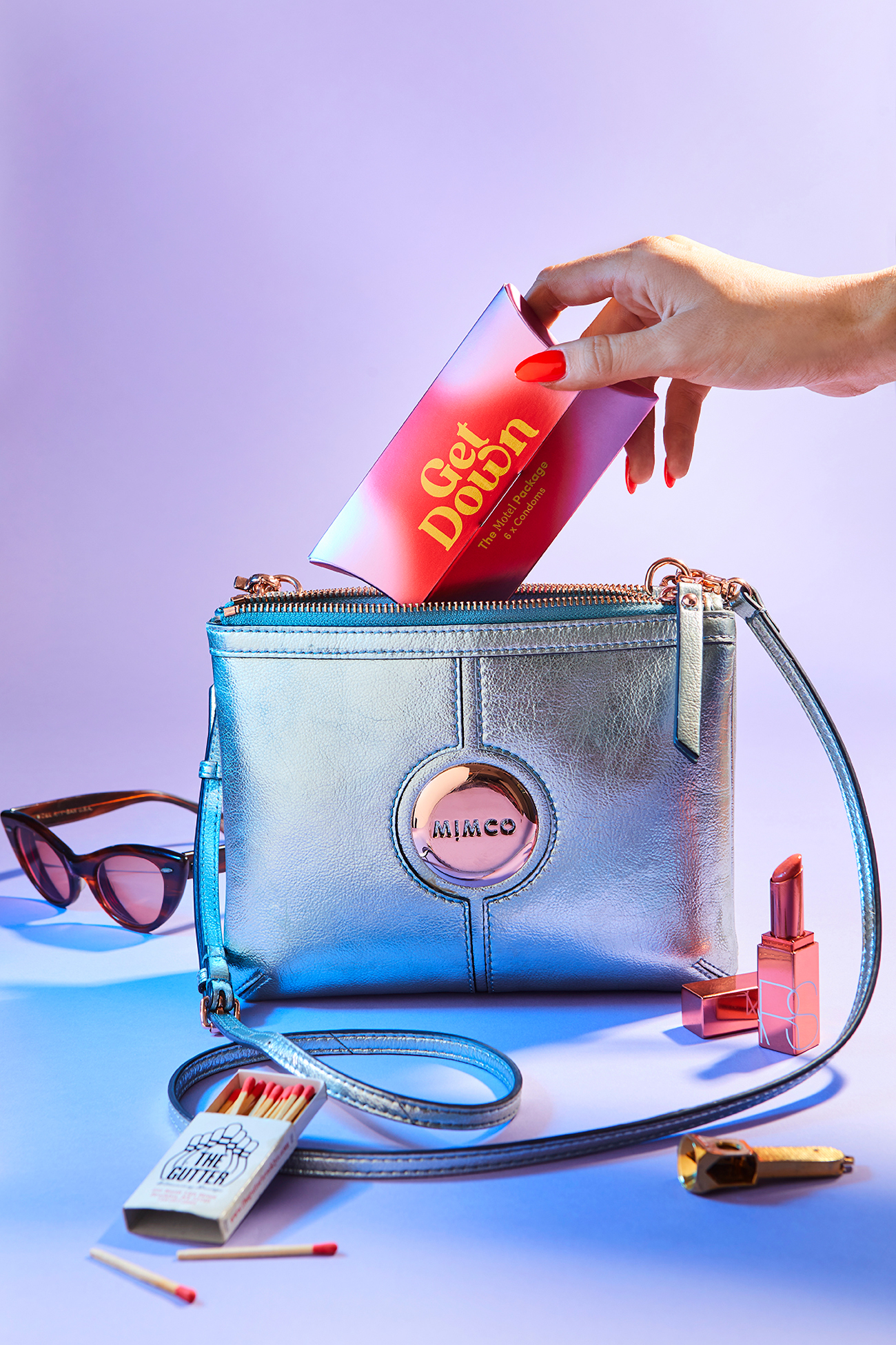
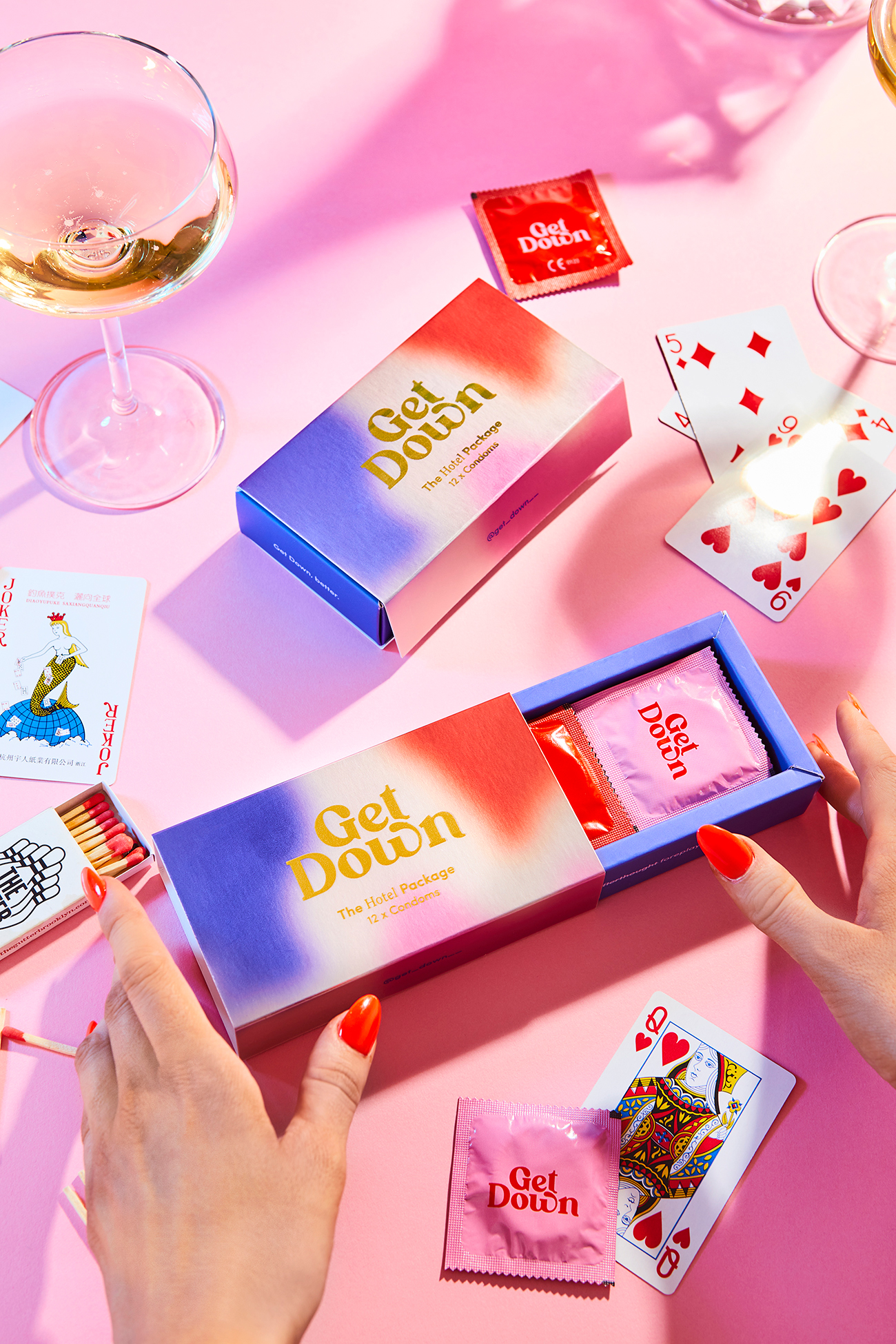
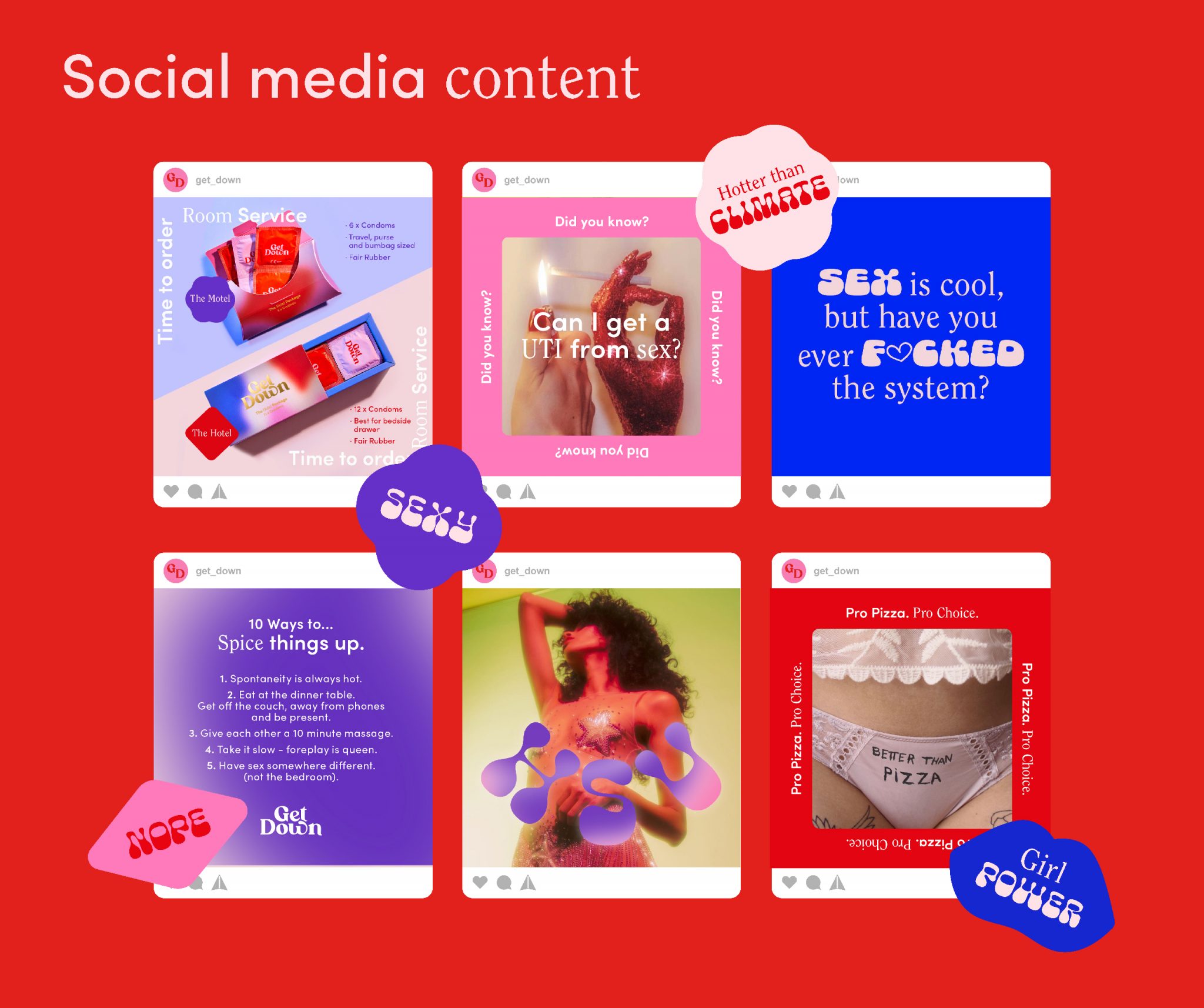
The visual world draws on the revolutionary spirit of the 1970s: bold, free and unapologetic, a decade when women were redefining their bodies, voices and choices. That energy became a graphic identity that is retro without being nostalgic, playful without being irresponsible and confident without being aggressive. The same world runs through the logo, the packaging and the photography.
MY ROLE
I built the brand from the ground up: concept, logo, visual identity, packaging design and photography art direction.
THE RESULT
A brand bold enough to stand out on shelf, human enough to start a conversation and purposeful enough to matter. Get Down reached Australian pharmacy shelves and caught the attention of Shark Tank investors.

Your brand
has something to say.
I make it visible.
© 2026 Maria Sin Acento. All rights reserved.